
New scrollbar look (was Re: [updates] 47 for 3.2alpha)Doug Way dway at riskmetrics.comTue Jan 22 08:18:38 UTC 2002
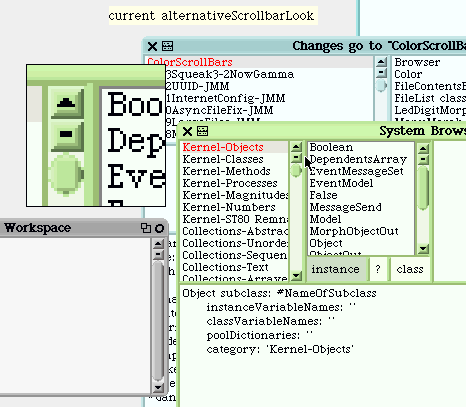
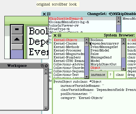
Dan Ingalls wrote:
> ...
> 4626ColoredScrollbars-ar -- Andreas Raab -- 18 December 2001
> A set of colored scrollbars for windows. Handled by the following preference...
> Preferences addPreference: #alternativeScrollbarLook categories: #(windows scrolling) default: true balloonHelp: 'When true, use scrollbars matching the #alternativeWindowLook preference'.

I'm surprised no one has commented on the new scrollbar look yet.

Obviously any discussion of the look of UI elements is going to be somewhat subjective... for my two cents I'd say the new (alternativeScrollbarLook) scrollbars look better in some ways, but are a little off in other ways.

The scrollbars now match the color of the parent window, which is good... the old blue & gray ones with the black border were looking rather out-of-place with the alternativeWindowLook.  (I think the alternativeWindowLook looks great, btw.)  The scrollbars now have a much lighter scrollbar background color, which is much nicer to make it easy to see the draggable slider/"thumb".  And moving the menu button below the up arrow seems like a reasonable idea.

My main complaint is that the rounded corners of the slider/thumb don't look quite right... the square-corner bevelling is overlaid with rounded corners such that there are a couple of noticeably dark pixels at the bottom (and sometimes the right side) of the scrollbar, which looks unnatural/clunky... an actual 3D rounded corner cylinder lit from above wouldn't be shaded this way.  For a widget such as the scrollbar which shows up frequently in the UI, I want it to look as natural as possible.  If we had special rounded bevelling to go with the rounded corners, that might be okay, but as it is it seems like it's overreaching a bit.

Other than that, I notice that the bevelling on the up/down/menu buttons is 3 pixels deep and has a lot of contrast, which seems a bit strong to me... it draws too much attention to the scrollbars, especially when you have inboard scrollbars turned on.  (The scrollbar bevelling is stronger than the titlebar and border bevelling in the rest of the window.)  Also, the extreme bevelling makes the small up/down/menu buttons look even smaller than they already are.  And the much darker slider "shadow" (when you drag) seems a bit drastic.  Ok, I'm probably being a bit picky, some of these may be a personal taste issue.  I know none of us claim to be graphic designers here (although my wife is one, and she sometimes criticizes my stuff :-) ).  And I know that twiddling
this stuff to get it to look just right can be a *lot* of work.

Actually, I was originally just checking out the new scrollbars with the #inboardScrollbars turned on.  I have to admit they look a bit better in flop-out mode, partly because there aren't so many, but also because the rounded up arrow and down arrow looks pretty good, and starts to tie the whole "rounded" look together a bit more.  Also, the arrow buttons are bigger which is nice.

Anyway, what I'm getting to is that I've been tweaking my own ColorScrollbars changesets for quite awhile now.  (My fault for not finishing it sooner.)  I'm sending it in another message as an [ENH].  It doesn't interfere with the alternativeScrollbarLook, it just changes the look of the scrollbars when the alternativeScrollbarLook is *off*, but the alternativeWindowLook is *on*.  I don't think anyone will miss the blue/gray scrollbars being gone when the alternativeWindowLook is on.  (There's still the old window look for that.  Actually, a preference for gray-colored scrollbars could be easily added if someone really wanted it.)

This changeset also tweaks the Color>>lighter/darker family, and makes various other fixes such as correcting the keyboard focus highlighting, hiding unusable scrollbars, etc., which are all listed in the preamble.

I've attached some pictures below of my ColorScrollbar look, and the current alternativeScrollbarLook, plus the old blue/gray scrollbar look for comparison.

Since I don't think anyone will miss the old blue/gray scrollbars with the alternative window look, I'd definitely like to see at least that part of the changeset accepted.

I would also somewhat prefer to have my non-alternative scrollbar look set as the default preference, since I think its clean & simple look is perhaps more appropriate as a default.  But if folks feel strongly about keeping the alternativeScrollbarLook preference on as the default, I could probably live with it.

Any opinions from any graphic designers/UI designers out there?  (are there any? :-) )

All other comments/criticism welcome.

- Doug Way
  dway at riskmetrics.com
-------------- next part --------------
A non-text attachment was scrubbed...
Name: myScrollbar.gif
Type: image/gif
Size: 14320 bytes
Desc: Unknown Document
Url : http://lists.squeakfoundation.org/pipermail/squeak-dev/attachments/20020122/de93791a/myScrollbar.gif
-------------- next part --------------
A non-text attachment was scrubbed...
Name: altScrollbar.gif
Type: image/gif
Size: 15205 bytes
Desc: Unknown Document
Url : http://lists.squeakfoundation.org/pipermail/squeak-dev/attachments/20020122/de93791a/altScrollbar.gif
-------------- next part --------------
A non-text attachment was scrubbed...
Name: oldScrollbar.gif
Type: image/gif
Size: 13890 bytes
Desc: Unknown Document
Url : http://lists.squeakfoundation.org/pipermail/squeak-dev/attachments/20020122/de93791a/oldScrollbar.gif
More information about the Squeak-dev mailing list |