
[squeak-dev] font huge or tiny, how to make it just right?Lauren Pullen drurowin at gmail.comThu Mar 10 19:20:20 UTC 2022
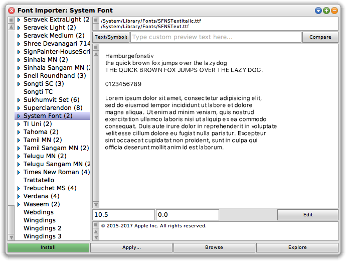
Hi Marcel,

On 3/7/22 07:17, Marcel Taeumel wrote:
> You don't have to adjust the glyph scale. You can also just increase the point size or use a display with higher PPI. :-) For Squeak's default "Bitstream Vera Sans" I added a "For Squeak" variant that has 1.056 extra glyph scale, which looks okay at 10.5pt (96 PPI / 100%).
>
> You only have to adjust the glyph scale if the 0.5pt steps in fonts are not fine-grained enough for your setup. With which values are you experimenting in your setup?
On mine, the default glyph scale results in unreadable glyphs at 10.5pt.
 They're technically readable, but appear blurry or aliased and cause
vision strain.  See the two attached images for without and with glyph
scale applied for an example.  Scaled is crisp, while unscaled has a
light grey drop shadow from aliasing.
-------------- next part --------------
A non-text attachment was scrubbed...
Name: Font Importer: System Font woScale.png
Type: image/png
Size: 68746 bytes
Desc: not available
URL: <http://lists.squeakfoundation.org/pipermail/squeak-dev/attachments/20220310/f7385a82/attachment-0002.png>
-------------- next part --------------
A non-text attachment was scrubbed...
Name: Font Importer: System Font wScale.png
Type: image/png
Size: 70190 bytes
Desc: not available
URL: <http://lists.squeakfoundation.org/pipermail/squeak-dev/attachments/20220310/f7385a82/attachment-0003.png>
More information about the Squeak-dev mailing list |