
A new default look for Squeak, revisitedHenrik Gedenryd Henrik.Gedenryd at lucs.lu.seThu Jun 29 20:33:06 UTC 2000
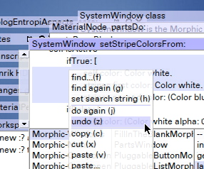
A few days ago there was a call for us to come up with suggestions for a new
defult look. For what it's worth, in the absence of others, I've included a
couple of pictures of the look I have put together myself when I've been
bored with my 'real' job, mostly to play around with translucency. There is
not really any conscious design behind this, except to keep it simple, I
guess. I don't like things that are flashy at first but become too much in
the long run.

I've included two images here that I've tried to keep small. One puts
together most of the look's elements in a small space, so it looks rather
messy to get it all into a small space. (And yes, it shows the general
problem with tranlucency as well.)

The other, really tiny one, shows what the 'window resizing dot' looks like,
here I have placed the arrow on the line between two panes in a browser.
(The dot is normally yellow.) I did it as an experiment with translucent
gradients.

I've placed a bigger, less cramped image on the web, which should give a
better impression of what it actually looks like to work with (220k):

http://www.lucs.lu.se/people/Henrik.Gedenryd/Squeak/bigedit.jpg

A second one looks pretty much the same, but with more menus to illustrate
how well the translucency works for text on text:

http://www.lucs.lu.se/people/Henrik.Gedenryd/Squeak/largewmenu.jpg

Speaking in general (and I'm not sure my ad hoc toying around is a good
example of this), I think an interface should exploit the unique
capabilities of Squeak, and not try to imitate something else (and
imitations are only either bad, or at best similar to the original, which
isn't very exciting anyway). Perhaps the translucency (& when combined with
gradients) are examples of this. Oh, yeah, morphs & windows should be
translucent when dragged--but I haven't quite figured the best way to do
that yet.

To digress a little, to improve also the quality (and not merely apply
lipstick), Squeak should become more object- and less window/widget-oriented
also in the interface, towards Direct Manipulation. Eg. today's menus are
mostly merely lightly glorified typed commands--and in some confused
arrangement, (help menu->preferences, projects in at lest 3 places, etc.)
For instance, instead of a change set browser (two in fact) where you can
see the sets, there should be change set morphs that _are_ the sets, and so
on.

But back to the issue at hand. If people would like this included in the
distribution, I'll package it up as a change set. (It's quite simple in
fact, to 95% some changed color parameters in various places.) The font is
the only thing that can't be expected to work generally (yet), and (as
usual) it is intended for LCD screens anyway. I can browse the X11 fonts et
al and see what I find.

Secondly, the window titles are an unrelated feature, which I nevertheless
can include. They merely describe what's in the window (good when it's
collapsed or partially covered) instead of writing "System Browser" etc. in
five places on the screen. If you want that, I can include it as well. (I'll
leave the close box on the left as well, it just ended up on the right at
one point).

Henrik


-------------- next part --------------
A non-text attachment was scrubbed...
Name: not available
Type: image/jpeg
Size: 56517 bytes
Desc: not available
Url : http://lists.squeakfoundation.org/pipermail/squeak-dev/attachments/20000629/faab7a02/attachment.jpeg
-------------- next part --------------
A non-text attachment was scrubbed...
Name: not available
Type: image/jpeg
Size: 7191 bytes
Desc: not available
Url : http://lists.squeakfoundation.org/pipermail/squeak-dev/attachments/20000629/faab7a02/attachment-0001.jpeg
More information about the Squeak-dev mailing list |