
TrueTypeRon Jeffries ronjeffries at acm.orgSat Mar 19 07:31:14 UTC 2005
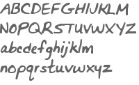
On Saturday, March 19, 2005, at 12:17:32 AM, Yoshiki Ohshima wrote:

>> That seems to make the black outlines go away (though /why/ I can't
>> begin to imagine). It's still cutting off the tops of letters and
>> the descenders, though.
>>
>> The TextMorph does that as well. The font displays properly in Word
>> (excuse the obscenity, please).

>   Is it the top and descenders, or is it actually the sides
> (the area beyond the imaginery rectangle whose width of the "advance
> width"?

>   Squeak's renderer cannot handle the glyph that is wider than the
> advance width.  It is not difficult to fix... Somebody should do it^^;

Attached are alphamorph.gif, an exported GIF from a TextMorph
containing the characters, and alphabetgood.gif, created with
another program. (The color isn't quite black on that one, but that
should make no difference, I hope.)

Notice that the characters are more bold, because they are outlined
in black, and that the descenders are lost on some letters (g, j, p,
q, y), and that the tops of some letters (B, Q, R, f) are cut off.

It seems to me that this basically isn't working, but I'm not seeing
what's up. Help will be welcome ... thanks.

Ron Jeffries
www.XProgramming.com
Example isn't another way to teach, it is the only way to teach.
  --Albert Einstein
-------------- next part --------------
A non-text attachment was scrubbed...
Name: alphabetgood.gif
Type: image/gif
Size: 3239 bytes
Desc: not available
Url : http://lists.squeakfoundation.org/pipermail/squeak-dev/attachments/20050319/791461c6/alphabetgood.gif
-------------- next part --------------
A non-text attachment was scrubbed...
Name: alphamorph.gif
Type: image/gif
Size: 2292 bytes
Desc: not available
Url : http://lists.squeakfoundation.org/pipermail/squeak-dev/attachments/20050319/791461c6/alphamorph.gif
More information about the Squeak-dev mailing list |