
HI,
After a while, I have played with the latest OLPC eToys, and I'd like to share a few notes. I was running it on "regular" Linux distro .
1) A few notes about eToys experience:
- I really like the eToys new look, cleanup and changes.
- It seems that some menus have been simplified, which is great.
- The intro with 5 clouds and runing car is nice and fun! (Actually it would be fun if all menus were turned into clouds :) ) - one note here, it seems the "Load a Project" text is _not embedded_ in it's cloud.
- I think the largest potential issue is ease of eToys navigation for someone who is running the system for the first time. I am thinking how to modify the UI, without significant changes, to help a new user to not "get lost" (for example by following a few projects from the cloud menu). I think people's sense "not getting lost" is greatly satisfied when there is a way to know "how to go back" - either one step back, or all the way to the beginning. I realize this is where the "Navigator->Prev" is used, but it is not very obvious for a first time user, mostly because it's contents (the Prev button) is "hidden". I am thinking if the following would help:
- By default, always show the "Navigator" toolbar contents "expanded", so user can see the "New/Prev". This way it would be more obvious how to go back. It seems to me this would be a nice usability help for a small price
- Rename "Prev" to "Previous" or "Back". Add a more explicit popup, instead of "Previous Project", maybe "This button will take you back to the previous project"
- Add a "Home" button, to "Navigator". The "Home" button would take user all the way to the clouds menu.
- The demo is "modifiable" which is nice for playing, but at the same time it would be good if there was a way to revert it back to the initial state. The book now has this option which I love.
- A bigger change, and probably overkill, would be at the time of entry to any project, a popup would show for 5 second, something like "Use the red Navigator button on the bottom-left to go back where you came from". This would, at all times, give a small hint as to how to navigate.
- In general, the popup help on various items could be more wordy. One example, on "Supplies", instead of "A Source for many basic types of Objects" popup, could be "Click here to find useful objects. You can drag out objects to the area above and start using them". I do not mean this one thing is a problem, but in general I find it helpful if popup help is a bit more wordy, not sure this is the best for all ages though...
2) Next, about how to help more users to try OLPC eToys. I am running on "regular" Linux distro (non-olpc, Suse 10.2), by installing yum and then following steps on this page: http://etoys.laptop.org/. Perhaps a note could be added to http://etoys.laptop.org/, to explain that the steps described there will allow running OLPC eToys on any (reasonably recent) Linux system. (It was not clear to me, and I hesitated to install the RPMs). Also, I am thinking it would help teachers and interested people to try OLPC version of eToys, if we add a few links on how to run OLPC eToys on Windows, and Mac, maybe just a link to the Windows OLPC emulation page.
Sorry this is longer than I wanted, I really love the changes and cleanup, great work,
Milan

On Apr 2, 2007, at 0:20 , Milan Zimmermann wrote:
- Next, about how to help more users to try OLPC eToys. I am running
on "regular" Linux distro (non-olpc, Suse 10.2), by installing yum and then following steps on this page: http://etoys.laptop.org/. Perhaps a note could be added to http://etoys.laptop.org/, to explain that the steps described there will allow running OLPC eToys on any (reasonably recent) Linux system. (It was not clear to me, and I hesitated to install the RPMs). Also, I am thinking it would help teachers and interested people to try OLPC version of eToys, if we add a few links on how to run OLPC eToys on Windows, and Mac, maybe just a link to the Windows OLPC emulation page.
I added a link to the wiki page, please add further instructions or links to that page.
- Bert -
On 2007 April 1 17:56, Bert Freudenberg wrote:
On Apr 2, 2007, at 0:20 , Milan Zimmermann wrote:
- Next, about how to help more users to try OLPC eToys. I am running
<<snip>>
I added a link to the wiki page, please add further instructions or links to that page.
Bert I think you mean the page here: http://wiki.laptop.org/go/Etoys
I added there a brief description with links on how to run OLPC eToys without the laptop available (emulation or rpms), hope that is ok.
Milan
- Bert -
On Apr 8, 2007, at 3:44 , Milan Zimmermann wrote:
On 2007 April 1 17:56, Bert Freudenberg wrote:
On Apr 2, 2007, at 0:20 , Milan Zimmermann wrote:
- Next, about how to help more users to try OLPC eToys. I am
running
<<snip>>
I added a link to the wiki page, please add further instructions or links to that page.
Bert I think you mean the page here: http://wiki.laptop.org/go/Etoys
I added there a brief description with links on how to run OLPC eToys without the laptop available (emulation or rpms), hope that is ok.
Sure. Although the simplest is to run just the image on your favorite Squeak VM. The latest image and projects is always here:
http://etoys.laptop.org/src/etoys-image-and-pr.zip
There are people interested in OLPC etoys who are not familiar with Squeak, so OS specific instructions would be helpful I guess.
Running like this won't get you Sugar integration, but unless you specifically want to test or develop in that area, it is fine. We need a lot of testing and content development independently of Sugar ...
- Bert -
On 2007 April 8 04:50, Bert Freudenberg wrote:
On Apr 8, 2007, at 3:44 , Milan Zimmermann wrote:
<<snip>>
I added there a brief description with links on how to run OLPC eToys without the laptop available (emulation or rpms), hope that is ok.
Sure. Although the simplest is to run just the image on your favorite Squeak VM. The latest image and projects is always here:
Ah I see. I thought the changes in OLPC VM mean this can no longer be done.
I added another way to run eToys OLPC (for Content Creators, Testers) by installing Squeakland and dropping OLPC eToys image on it. Instruction including some screenshots are here
http://wiki.laptop.org/go/Etoys#Running_OLPC_eToys_if_you_do_not_have_OLPC_l...
(so far Windows only, I use Linux but I think most such users will be Windows.)
There are people interested in OLPC etoys who are not familiar with Squeak, so OS specific instructions would be helpful I guess.
I agree - I do not know how to do Mac if someone can describe it I could add it there.
Running like this won't get you Sugar integration, but unless you specifically want to test or develop in that area, it is fine. We need a lot of testing and content development independently of Sugar ...
Yes - what content is the eToys team looking for (which age group etc)?
Milan
- Bert -

On Apr 8, 2007, at 5:50 AM, Bert Freudenberg wrote:
On Apr 8, 2007, at 3:44 , Milan Zimmermann wrote:
On 2007 April 1 17:56, Bert Freudenberg wrote:
On Apr 2, 2007, at 0:20 , Milan Zimmermann wrote:
- Next, about how to help more users to try OLPC eToys. I am
running
<<snip>>
I added a link to the wiki page, please add further instructions or links to that page.
Bert I think you mean the page here: http://wiki.laptop.org/go/Etoys
I added there a brief description with links on how to run OLPC eToys without the laptop available (emulation or rpms), hope that is ok.
Sure. Although the simplest is to run just the image on your favorite Squeak VM. The latest image and projects is always here:
http://etoys.laptop.org/src/etoys-image-and-pr.zip
There are people interested in OLPC etoys who are not familiar with Squeak, so OS specific instructions would be helpful I guess.
To run OLPC Etoys independly of Sugar - in a Mac, do the following:
1. place the folder you downloaded — etoys-image-and-pr — to, say, the main Squeak folder (under the Applications folder).
2. create an alias (mac term for shortcut) for the etoys.image and place it on the desktop (or wherever you like...).
3. if you already have one alias there, now you have two! No problem. You can use either, depending on your target. You can't, of course, use both simultaneously.
cheers, Paulo
Running like this won't get you Sugar integration, but unless you specifically want to test or develop in that area, it is fine. We need a lot of testing and content development independently of Sugar ...
- Bert -
Etoys mailing list Etoys@laptop.org http://mailman.laptop.org/mailman/listinfo/etoys

Milan,
Your suggestions were great! I kept silence, but I was attempting to solve some of the issues you raised.
What we've been talking about is to have a Sugar-like menu bar for Etoys. There are a few ways of doing it, but I now made one in Morphic. Please update your image.
With the latest change, you now have a stationary menu bar that resembles the activities in Sugar have. For now, the functionality is almost just copy of our nav-bar. If the user is familiar with the browser activity of Sugar, he should have better chance to figure out how to go back in EToys as well.
Some more things:
- I can think of adding "home" button to really go to the initial screen. - I'm planning to add the tooltip or baloon help for these buttons. - I know that the viewer tab placement has to be fixed. - I have to say that the gray color looks horrible... But for the general audience, similarity to the other Sugar apps should mean something. (I would say that we can make it look a bit more playful yet the overall button design inherits the design of Sugar buttons.) - The button size currently I use is too small compared to the other Sugar activities. It should be fixed.
Let me know what you think!
-- Yoshiki
- I think the largest potential issue is ease of eToys navigation for
someone who is running the system for the first time. I am thinking how to modify the UI, without significant changes, to help a new user to not "get lost" (for example by following a few projects from the cloud menu). I think people's sense "not getting lost" is greatly satisfied when there is a way to know "how to go back" - either one step back, or all the way to the beginning. I realize this is where the "Navigator->Prev" is used, but it is not very obvious for a first time user, mostly because it's contents (the Prev button) is "hidden". I am thinking if the following would help:
- By default, always show the "Navigator" toolbarcontents "expanded", so user can see the "New/Prev". This way it would be more obvious how to go back. It seems to me this would be a nice usability help for a small price
- Rename "Prev" to "Previous" or "Back". Add a more explicit popup,instead of "Previous Project", maybe "This button will take you back to the previous project"
- Add a "Home" button, to "Navigator". The "Home" button would takeuser all the way to the clouds menu.
- The demo is "modifiable" which is nice for playing, but at the sametime it would be good if there was a way to revert it back to the initial state. The book now has this option which I love.
- A bigger change, and probably overkill, would be at the time ofentry to any project, a popup would show for 5 second, something like "Use the red Navigator button on the bottom-left to go back where you came from". This would, at all times, give a small hint as to how to navigate.
- In general, the popup help on various items could be more wordy. One
example, on "Supplies", instead of "A Source for many basic types of Objects" popup, could be "Click here to find useful objects. You can drag out objects to the area above and start using them". I do not mean this one thing is a problem, but in general I find it helpful if popup help is a bit more wordy, not sure this is the best for all ages though...
- Next, about how to help more users to try OLPC eToys. I am running
on "regular" Linux distro (non-olpc, Suse 10.2), by installing yum and then following steps on this page: http://etoys.laptop.org/. Perhaps a note could be added to http://etoys.laptop.org/, to explain that the steps described there will allow running OLPC eToys on any (reasonably recent) Linux system. (It was not clear to me, and I hesitated to install the RPMs). Also, I am thinking it would help teachers and interested people to try OLPC version of eToys, if we add a few links on how to run OLPC eToys on Windows, and Mac, maybe just a link to the Windows OLPC emulation page.
Sorry this is longer than I wanted, I really love the changes and cleanup, great work,
Milan _______________________________________________ Etoys mailing list Etoys@laptop.org http://mailman.laptop.org/mailman/listinfo/etoys
That's a great start, Yoshiki :)
Why did you make that flap unremovable? I can't even get a halo on it. It should be visible by default, I agree, but shouldn't there be a way to hide it, too?
- Bert -
On Apr 10, 2007, at 9:31 , Yoshiki Ohshima wrote:
Milan,
Your suggestions were great! I kept silence, but I was attempting to solve some of the issues you raised.
What we've been talking about is to have a Sugar-like menu bar for Etoys. There are a few ways of doing it, but I now made one in Morphic. Please update your image.
With the latest change, you now have a stationary menu bar that resembles the activities in Sugar have. For now, the functionality is almost just copy of our nav-bar. If the user is familiar with the browser activity of Sugar, he should have better chance to figure out how to go back in EToys as well.
Some more things:
- I can think of adding "home" button to really go to the initial screen.
- I'm planning to add the tooltip or baloon help for these buttons.
- I know that the viewer tab placement has to be fixed.
- I have to say that the gray color looks horrible... But for the general audience, similarity to the other Sugar apps should mean something. (I would say that we can make it look a bit more playful yet the overall button design inherits the design of Sugar buttons.)
- The button size currently I use is too small compared to the other Sugar activities. It should be fixed.
Let me know what you think!
-- Yoshiki
- I think the largest potential issue is ease of eToys
navigation for someone who is running the system for the first time. I am thinking how to modify the UI, without significant changes, to help a new user to not "get lost" (for example by following a few projects from the cloud menu). I think people's sense "not getting lost" is greatly satisfied when there is a way to know "how to go back" - either one step back, or all the way to the beginning. I realize this is where the "Navigator->Prev" is used, but it is not very obvious for a first time user, mostly because it's contents (the Prev button) is "hidden". I am thinking if the following would help:
- By default, always show the "Navigator" toolbarcontents "expanded", so user can see the "New/Prev". This way it would be more obvious how to go back. It seems to me this would be a nice usability help for a small price
- Rename "Prev" to "Previous" or "Back". Add a moreexplicit popup, instead of "Previous Project", maybe "This button will take you back to the previous project"
- Add a "Home" button, to "Navigator". The "Home" buttonwould take user all the way to the clouds menu.
- The demo is "modifiable" which is nice for playing, butat the same time it would be good if there was a way to revert it back to the initial state. The book now has this option which I love.
- A bigger change, and probably overkill, would be at thetime of entry to any project, a popup would show for 5 second, something like "Use the red Navigator button on the bottom-left to go back where you came from". This would, at all times, give a small hint as to how to navigate.
- In general, the popup help on various items could be more
wordy. One example, on "Supplies", instead of "A Source for many basic types of Objects" popup, could be "Click here to find useful objects. You can drag out objects to the area above and start using them". I do not mean this one thing is a problem, but in general I find it helpful if popup help is a bit more wordy, not sure this is the best for all ages though...
- Next, about how to help more users to try OLPC eToys. I am
running on "regular" Linux distro (non-olpc, Suse 10.2), by installing yum and then following steps on this page: http://etoys.laptop.org/. Perhaps a note could be added to http://etoys.laptop.org/, to explain that the steps described there will allow running OLPC eToys on any (reasonably recent) Linux system. (It was not clear to me, and I hesitated to install the RPMs). Also, I am thinking it would help teachers and interested people to try OLPC version of eToys, if we add a few links on how to run OLPC eToys on Windows, and Mac, maybe just a link to the Windows OLPC emulation page.
Sorry this is longer than I wanted, I really love the changes and cleanup, great work,
Milan _______________________________________________ Etoys mailing list Etoys@laptop.org http://mailman.laptop.org/mailman/listinfo/etoys
Etoys mailing list Etoys@laptop.org http://mailman.laptop.org/mailman/listinfo/etoys
Bert,
Thank you for the feedback!
Why did you make that flap unremovable? I can't even get a halo on it. It should be visible by default, I agree, but shouldn't there be a way to hide it, too?
I was thinking about the classroom setting, where the teacher wouldn't want to deal with dissappearing menu bars. (For that matter, The earlier Japanese version of Etoys suppress the halo for Navigator flap. It has certain advantages, as many number of kids dismiss the navigator when they learned how to delete a morph via "X" icon.)
From the flap menu, it should be able to hide and show the "Sugar Navigator Flap." (But clearly my logic of it is flawed and it didn't work quite as expected.) I'm not sure if allowing the manipulation on it via halo is a good idea. (For some demo purpose, it would be absolute fun to be able to script that bar, though...)
-- Yoshiki

Hi folks,
Almost all of the features you're talking about are already implemented (and working for years) in the Small-Land image.
In beginner mode, the dockbars can't be removed nor moved nor sized. But in non-beginner mode, the standard halos are available to handle the dock-bars.
More to say: This Small-Land changes are already included in 3.9. I propose to use/expand THIS work instead of create another implementation.
Cheers,
-- Diego
Bert,
Thank you for the feedback!
Why did you make that flap unremovable? I can't even get a halo on it. It should be visible by default, I agree, but shouldn't there be a way to hide it, too?
I was thinking about the classroom setting, where the teacher wouldn't want to deal with dissappearing menu bars. (For that matter, The earlier Japanese version of Etoys suppress the halo for Navigator flap. It has certain advantages, as many number of kids dismiss the navigator when they learned how to delete a morph via "X" icon.)
From the flap menu, it should be able to hide and show the "Sugar Navigator Flap." (But clearly my logic of it is flawed and it didn't work quite as expected.) I'm not sure if allowing the manipulation on it via halo is a good idea. (For some demo purpose, it would be absolute fun to be able to script that bar, though...)
-- Yoshiki

Hi Diego -
As nice as it sounds I don't think switching to 3.9 is a real option at this point. There is quite a bit of heritage to the OLPC line of images that would need to be recreated in 3.9 and it would be quite a gamble to switch the basis for OLPC at this point (remember: summer is supposed to be the drop-dead date for the first several million OLPC units).
One thing that would be helpful though is if you could point out where the relevant portions of this work in 3.9 are - porting it to OLPC sounds a lot more viable than porting OLPC to 3.9 ;-)
Cheers, - Andreas
Diego Gomez Deck wrote:
Hi folks,
Almost all of the features you're talking about are already implemented (and working for years) in the Small-Land image.
In beginner mode, the dockbars can't be removed nor moved nor sized. But in non-beginner mode, the standard halos are available to handle the dock-bars.
More to say: This Small-Land changes are already included in 3.9. I propose to use/expand THIS work instead of create another implementation.
Cheers,
-- Diego
Bert,
Thank you for the feedback!
Why did you make that flap unremovable? I can't even get a halo on it. It should be visible by default, I agree, but shouldn't there be a way to hide it, too?
I was thinking about the classroom setting, where the teacher wouldn't want to deal with dissappearing menu bars. (For that matter, The earlier Japanese version of Etoys suppress the halo for Navigator flap. It has certain advantages, as many number of kids dismiss the navigator when they learned how to delete a morph via "X" icon.)
From the flap menu, it should be able to hide and show the "Sugar Navigator Flap." (But clearly my logic of it is flawed and it didn't work quite as expected.) I'm not sure if allowing the manipulation on it via halo is a good idea. (For some demo purpose, it would be absolute fun to be able to script that bar, though...)
-- Yoshiki
Etoys mailing list Etoys@laptop.org http://mailman.laptop.org/mailman/listinfo/etoys
Hi Andreas,
Hi Diego -
As nice as it sounds I don't think switching to 3.9 is a real option at this point. There is quite a bit of heritage to the OLPC line of images that would need to be recreated in 3.9 and it would be quite a gamble to switch the basis for OLPC at this point (remember: summer is supposed to be the drop-dead date for the first several million OLPC units).
Sure. In fact I'm not proposing switch to 3.9. I propose to "backport" the Small-Land changes to OLPC image.
One thing that would be helpful though is if you could point out where the relevant portions of this work in 3.9 are - porting it to OLPC sounds a lot more viable than porting OLPC to 3.9 ;-)
Do you remember the BigBang* changesets? I think I remember you used them as an counter example for the declarative monticello model.
In any case, I can do the port for myself in case you like it.
Cheers,
- Andreas
Cheers,
-- Diego
Diego Gomez Deck wrote:
Hi folks,
Almost all of the features you're talking about are already implemented (and working for years) in the Small-Land image.
In beginner mode, the dockbars can't be removed nor moved nor sized. But in non-beginner mode, the standard halos are available to handle the dock-bars.
More to say: This Small-Land changes are already included in 3.9. I propose to use/expand THIS work instead of create another implementation.
Cheers,
-- Diego
Bert,
Thank you for the feedback!
Why did you make that flap unremovable? I can't even get a halo on it. It should be visible by default, I agree, but shouldn't there be a way to hide it, too?
I was thinking about the classroom setting, where the teacher wouldn't want to deal with dissappearing menu bars. (For that matter, The earlier Japanese version of Etoys suppress the halo for Navigator flap. It has certain advantages, as many number of kids dismiss the navigator when they learned how to delete a morph via "X" icon.)
From the flap menu, it should be able to hide and show the "Sugar Navigator Flap." (But clearly my logic of it is flawed and it didn't work quite as expected.) I'm not sure if allowing the manipulation on it via halo is a good idea. (For some demo purpose, it would be absolute fun to be able to script that bar, though...)
-- Yoshiki
I like the Smallland bar. We should try to mimic the OLPC interface though, like Yoshiki's bar does.
- Bert -
On Apr 11, 2007, at 10:14 , Diego Gomez Deck wrote:
Hi Andreas,
Hi Diego -
As nice as it sounds I don't think switching to 3.9 is a real option at this point. There is quite a bit of heritage to the OLPC line of images that would need to be recreated in 3.9 and it would be quite a gamble to switch the basis for OLPC at this point (remember: summer is supposed to be the drop-dead date for the first several million OLPC units).
Sure. In fact I'm not proposing switch to 3.9. I propose to "backport" the Small-Land changes to OLPC image.
One thing that would be helpful though is if you could point out where the relevant portions of this work in 3.9 are - porting it to OLPC sounds a lot more viable than porting OLPC to 3.9 ;-)
Do you remember the BigBang* changesets? I think I remember you used them as an counter example for the declarative monticello model.
In any case, I can do the port for myself in case you like it.
Cheers,
- Andreas
Cheers,
-- Diego
Diego Gomez Deck wrote:
Hi folks,
Almost all of the features you're talking about are already implemented (and working for years) in the Small-Land image.
In beginner mode, the dockbars can't be removed nor moved nor sized. But in non-beginner mode, the standard halos are available to handle the dock-bars.
More to say: This Small-Land changes are already included in 3.9. I propose to use/expand THIS work instead of create another implementation.
Cheers,
-- Diego
Bert,
Thank you for the feedback!
Why did you make that flap unremovable? I can't even get a halo on it. It should be visible by default, I agree, but shouldn't there be a way to hide it, too?
I was thinking about the classroom setting, where the teacher wouldn't want to deal with dissappearing menu bars. (For that matter, The earlier Japanese version of Etoys suppress the halo for Navigator flap. It has certain advantages, as many number of kids dismiss the navigator when they learned how to delete a morph via "X" icon.)
From the flap menu, it should be able to hide and show the "Sugar Navigator Flap." (But clearly my logic of it is flawed and it didn't work quite as expected.) I'm not sure if allowing the manipulation on it via halo is a good idea. (For some demo purpose, it would be absolute fun to be able to script that bar, though...)
-- Yoshiki
Etoys mailing list Etoys@laptop.org http://mailman.laptop.org/mailman/listinfo/etoys
Diego,
Almost all of the features you're talking about are already implemented (and working for years) in the Small-Land image.
Yes, I was totally aware that (as Offray pointed out couples of times on this list), and when I was writing "something more playful", I was thinking about that. I should have mentioned that in previous emails. My apology.
In beginner mode, the dockbars can't be removed nor moved nor sized. But in non-beginner mode, the standard halos are available to handle the dock-bars.
More to say: This Small-Land changes are already included in 3.9. I propose to use/expand THIS work instead of create another implementation.
The Sugar-like bar is about "killing" most of features that Doc and even Morphs offers so subclassing from DockingBar wouldn't be so much of advantage. But sure, I'm certain that we'll be copying from and looking at the implementation of DocingBar...
Thank you for pointing it out!
-- Yoshiki
Hello,
I published another changeset for the "Sugar-like Nav bar" that is some incremental improvement over the previous version. It still have bugs, but it would be a good timing for it to publish.
Now, you can:
* Get the halo on the bar. * From the flap menu in the world menu, you can show and hide it. * From the white halo menu handle, you can change the edge to cling to #top or #bottom. * From the whilte halo menu handle, you can choose "use default green look" to change the default colors to green and dark green.
and:
* The Undo button changes its look when you cannot undo. * There is a proper margin on the left.
One thing that doesn't work is, when you publish a project, the bar doesn't come back.
Milan and Alan suggested to me slightly different but similar ideas. The back (and forward) should show more information. A list of projects as you would see in typical web browsers and/or thumbnail of the projects. One interesting thing is that previous and next buttons with thumbnails is very similar to the thread navigation morph. It would be nice if the "Bar" can have another mode that behaves like a thread navigation.
I'll make some more small incremental changes, and make it really usable soon.
-- Yoshiki

Thanks Yoshiki!
Cheers,
Alan
---------------
At 01:56 PM 4/17/2007, Yoshiki Ohshima wrote:
Hello,
I published another changeset for the "Sugar-like Nav bar" that is some incremental improvement over the previous version. It still have bugs, but it would be a good timing for it to publish.
Now, you can:
- Get the halo on the bar.
- From the flap menu in the world menu, you can show and hide it.
- From the white halo menu handle, you can change the edge to cling to #top or #bottom.
- From the whilte halo menu handle, you can choose "use default green look" to change the default colors to green and dark green.
and:
- The Undo button changes its look when you cannot undo.
- There is a proper margin on the left.
One thing that doesn't work is, when you publish a project, the bar doesn't come back.
Milan and Alan suggested to me slightly different but similar ideas. The back (and forward) should show more information. A list of projects as you would see in typical web browsers and/or thumbnail of the projects. One interesting thing is that previous and next buttons with thumbnails is very similar to the thread navigation morph. It would be nice if the "Bar" can have another mode that behaves like a thread navigation.
I'll make some more small incremental changes, and make it really usable soon.
-- Yoshiki
Etoys mailing list Etoys@laptop.org http://mailman.laptop.org/mailman/listinfo/etoys

Yoshiki Ohshima skrev:
Hello,
One thing that doesn't work is, when you publish a project, the bar doesn't come back.
I pushed another update and this is now covered. For other ideas, please let me know.
I have a few ideas.
I noticed that there were tool tips popping up on the Sugar icons, that would be nice on the etoys menu bar.
The icon you use for selecting language is very similar to the icon used for web browser in the Sugar bar. I think a miniature flag for each language could be nice, maybe have it change from a grey and white to a color one on mouseover ?
Could we have the trashcan in the menubar too?
Karl
Hi, Karl,
I noticed that there were tool tips popping up on the Sugar icons, that would be nice on the etoys menu bar.
I'm adding balloon help. I thought I would follow the Sugar's convension and do the rectangular pop-ups, but there was wise voice: "In Sugar, some things show extra buttons and some things show mere help. The problem is that both of them look the same. Even they will realize it is a bad idea if they get some time to think about it." So, I'm taking an easier way so far and just do the balloon help.
The icon you use for selecting language is very similar to the icon used for web browser in the Sugar bar.
I'm not sure if you are looking at the version I published yesterday. In that version, the icon looks like staggered flags (though only top-most one is really visible and it does look like the browser's icon.)
I think a miniature flag for each language could be nice, maybe have it change from a grey and white to a color one on mouseover ?
Well. the graphic of a miniature flag for each language would be hard to make. (And, can get too political, if you think about it.) In regards to color, it would make less sense if only one button does the color change.
Could we have the trashcan in the menubar too?
Hmm. And if we do, would we keep the trashcan morph?
-- Yoshiki
On Apr 19, 2007, at 1:06 , Yoshiki Ohshima wrote:
Hi, Karl,
I noticed that there were tool tips popping up on the Sugar icons, that would be nice on the etoys menu bar.
I'm adding balloon help.
Why is it green? We should only have one balloon help color IMHO. Use any color you like, but consistently.
The icon you use for selecting language is very similar to the icon used for web browser in the Sugar bar.
I'm not sure if you are looking at the version I published yesterday. In that version, the icon looks like staggered flags (though only top-most one is really visible and it does look like the browser's icon.)
It's better than before, yes, but still looks like the browser icon. Perhaps make a little wavy flag with an XO sign in it? No wait, that would look like the Jolly Roger. Though I might like that. My kids definitely would ;)
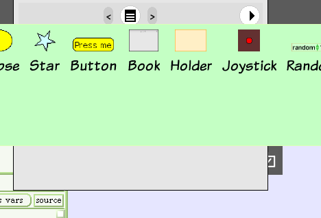
Also the supplies flap - I think it's a nice start. We'll need a better icon of course (maybe just a 3D box with open lid?). And I'd make the background light-gray though, right now the play field icon is invisible.
And the tab somehow is not right, it's behind other morphs, and it's hard to drag something into it while it's closed. Normally, a flap just pops open. It looks like this is broken for this flap, or for a flap attached to the right edge ... maybe because of the gap between the flap and the screen edge?
If we remove the random tile from that flap, all items will fit in one line. Otherwise, we at least need to adjust the default size so all items are visible.
Can we have a NEXT icon? I can't remember why we removed that from the navigator.
And we could remove the orange nav bar now, no?
- Bert -
Thanks, Bert,
I noticed that there were tool tips popping up on the Sugar icons, that would be nice on the etoys menu bar.
I'm adding balloon help.
Why is it green? We should only have one balloon help color IMHO. Use any color you like, but consistently.
There wasn't any strong reason, but more or less for me to know where to change.
The icon you use for selecting language is very similar to the icon used for web browser in the Sugar bar.
I'm not sure if you are looking at the version I published yesterday. In that version, the icon looks like staggered flags (though only top-most one is really visible and it does look like the browser's icon.)
It's better than before, yes, but still looks like the browser icon. Perhaps make a little wavy flag with an XO sign in it? No wait, that would look like the Jolly Roger. Though I might like that. My kids definitely would ;)
Icons welcome. All the icons, by the way have been made by Abe-san.
Also the supplies flap - I think it's a nice start. We'll need a better icon of course (maybe just a 3D box with open lid?).
OMG. Abe-san sent exactly that just before this email. Amazing synchronicity. I'll use that.
And I'd make the background light-gray though, right now the play field icon is invisible.
The idea was probably the background should follow the bar's color, and the light green is meant to be used with "default green look". Very light gray would be probably better for all cases.
And the tab somehow is not right, it's behind other morphs, and it's hard to drag something into it while it's closed. Normally, a flap just pops open. It looks like this is broken for this flap, or for a flap attached to the right edge ... maybe because of the gap between the flap and the screen edge?
I defined #wantsToBeTopmost method to avoid a morph comes in between the bar and supplies tab (that looks strange). The pop-open behavior is clearly broken.
If we remove the random tile from that flap, all items will fit in one line. Otherwise, we at least need to adjust the default size so all items are visible.
Yes.
Can we have a NEXT icon? I can't remember why we removed that from the navigator.
The questions we had was what next means. As I wrote, if there is some ways to explicitly see what comes next, that would be good. (In that case, the prev and next button can behave like thread navigator.) However, in other cases, specifying the thumbnail of a project would be better to go to a project.
And we could remove the orange nav bar now, no?
Totally, yes. I was waiting for somebody mention it, to give the impression that it isn't a unilateral decision^^;
Thank you!
-- Yoshiki
On Apr 20, 2007, at 17:47 , Yoshiki Ohshima wrote:
Also the supplies flap - I think it's a nice start. We'll need a better icon of course (maybe just a 3D box with open lid?).
OMG. Abe-san sent exactly that just before this email. Amazing synchronicity. I'll use that.
<openBox2White.png>
Hmm, well, I'd get rid of the double arrow (which indicates storage access in Sugar) and maybe make it trimetric.
http://simcity.ea.com/images/about/inside_scoop/3d1.gif
- Bert -
Bert Freudenberg wrote:
On Apr 20, 2007, at 17:47 , Yoshiki Ohshima wrote:
Also the supplies flap - I think it's a nice start. We'll need a better icon of course (maybe just a 3D box with open lid?).
OMG. Abe-san sent exactly that just before this email. Amazing synchronicity. I'll use that.
<openBox2White.png>
I think the bar is getting nice now.
How about having it act as the bars in Sugar which pops up when the mouse hits a corner ? And shouldn't the bar be top most morph to avoid confusing things like in the attached screenshot?
Karl
Karl
Hi, Karl,
I think the bar is getting nice now.
How about having it act as the bars in Sugar which pops up when the mouse hits a corner ?
Hmm... But what do we do with the Sugar frame if we make ours use the corners?
And shouldn't the bar be top most morph to avoid confusing things like in the attached screenshot?
At least, the bar, tab and the content of flap should have similar z-order, yes. My previous theory for the bar was to make it bottom-most in z-order so that the other morphs cannot be easily "lost". However, with the flap and (the ability to hide the bar), it might be ok to have it in front.
-- Yoshiki
Yoshiki Ohshima wrote:
Hi, Karl,
I think the bar is getting nice now.
How about having it act as the bars in Sugar which pops up when the mouse hits a corner ?
Hmm... But what do we do with the Sugar frame if we make ours use the corners?
Hm, you are right. I'm lost in modal land ...
And shouldn't the bar be top most morph to avoid confusing things like in the attached screenshot?
At least, the bar, tab and the content of flap should have similar z-order, yes. My previous theory for the bar was to make it bottom-most in z-order so that the other morphs cannot be easily "lost". However, with the flap and (the ability to hide the bar), it might be ok to have it in front.
Karl
Yoshiki Ohshima wrote:
Icons welcome. All the icons, by the way have been made by Abe-san.
I like his icons. Could you ask him if he could make a new trashcan icon, too. I don't think the current trashcan look so good.
Karl

Hi all,
Sorry, I hope this time the mail comes properly now.
Offray
-------
Hi all,
Diego Gomez Deck escribió:
Hi folks,
Almost all of the features you're talking about are already implemented (and working for years) in the Small-Land image.
That was what I was talking about in my mention on the Extremadura's Squeak images. Nice to have the author on this threat also :) and to have the possibility to finally talk with you (Blog commentaries and MSN talk were not much helpful previosly)
In beginner mode, the dockbars can't be removed nor moved nor sized. But in non-beginner mode, the standard halos are available to handle the dock-bars.
And as I said, this helps a lot to beginners in my experiences using the Extremadura's Squeak image for teaching at University.
More to say: This Small-Land changes are already included in 3.9. I propose to use/expand THIS work instead of create another implementation.
Would be nice to have the look and feel of the Yoshiki's dock bar in the behavior of the Diego's dock bar. But the dock bar seems a little buggy on 3.9. It works on 3.9-final#7067, but on previous or latter ones it doesn't keeps inside the projects even in the option "show dock bar" is enabled and one need to to disable and enable it to see inside every project and to get a consistent interface. On the other hand change sets for bugs like the one in bookmarks inside bookmorphs work well on OLPC image and Squeakland image but are not applicable on Extremadura's image. That fragmentation of work creates barriers for newcomers to the Squeak world in having a coherent view of the "different Squeaks", and lacks from sense compatibility and continuity from the omni user point of view. May be, as a new comer that I'm, I'm loosing something about some Squeak way to do things, but other newcomers here in Colombia share the same feeling and would be nice to have some defense or reason about that. ¿Would be possible to have more continuity on the "Squeak Multiverse"? and, for example, going from eToys to Bots Inc (and even Scratch) and from one interface to another or even generate content in one image to be usable in other even considering the different aspect ratio and screen resolution.
Cheers,
-- Diego
Cheers,
Offray
Hi Yoshiki,
I really like it, it is on top, uses same symbols as the rest of sugar (not saying sugar picked the most descriptive symbols but that's another thing). With some explanatory popups this should be good.
I think there is a good argument for it to be "not removable" (via halo) as you explained (certain things are good to be allowed to live forever :) ) Originally, I also thought it may make sense for it to be "hideable" in the sense of the operating systems start bars - but I have trouble imagining it not conflict with the sugar menu bar , I have not played with it for a while, does it still sort of "show" any time the mouse touches any border of the screen?
One suggestion and one note. - The suggestion is, when user clicks on the "new project", it should show the new project mini-window offset from top by 40 pixels, because right now, the new project mini-window hides the left 3 buttons on the new menu. - The note is (and really this is just a thinking process) - what if, the back button showed the image if the "previous project" - similarly to what the Thread Navigator did - something like this (attached) - (not saying I like it, just an experiment).
Thanks for working on it, more notes inline below v :
On 2007 April 10 03:31, Yoshiki Ohshima wrote:
Milan,
Your suggestions were great! I kept silence, but I was attempting to solve some of the issues you raised.
:) - I wish to be in position to help, but last 2 months I barely found time to even play with etoys/olpc.
What we've been talking about is to have a Sugar-like menu bar for Etoys. There are a few ways of doing it, but I now made one in Morphic. Please update your image.
I did and I like it as I said above!
With the latest change, you now have a stationary menu bar that resembles the activities in Sugar have. For now, the functionality is almost just copy of our nav-bar. If the user is familiar with the browser activity of Sugar, he should have better chance to figure out how to go back in EToys as well.
yes, it is more intuitive I think.
(BTW, what will the "reverted arrow" do?)
Some more things:
- I can think of adding "home" button to really go to the initial screen.
I think that would really be helpful. I will ask my kids and some friends to play with the changes this weekend - but they are older (16) so it's probably not representative.
- I'm planning to add the tooltip or baloon help for these buttons.
thanks that sounds great.
- I know that the viewer tab placement has to be fixed.
not sure what you mean by "viewer tab"
- I have to say that the gray color looks horrible... But for the general audience, similarity to the other Sugar apps should mean something. (I would say that we can make it look a bit more playful yet the overall button design inherits the design of Sugar buttons.)
I agree with you including the color observation - but for consistency I agree it is good to keep it for navigation bar.
- The button size currently I use is too small compared to the other Sugar activities. It should be fixed.
Interesting - if that is the case, maybe using the backround of the menu to convey additional information (as in the attached) would help use the space. But it again would remove consistency with Sugar.
Let me know what you think!
Good stuff :)
Milan
-- Yoshiki
- I think the largest potential issue is ease of eToys navigation for
someone who is running the system for the first time. I am thinking how to modify the UI, without significant changes, to help a new user to not "get lost" (for example by following a few projects from the cloud menu). I think people's sense "not getting lost" is greatly satisfied when there is a way to know "how to go back" - either one step back, or all the way to the beginning. I realize this is where the "Navigator->Prev" is used, but it is not very obvious for a first time user, mostly because it's contents (the Prev button) is "hidden". I am thinking if the following would help:
- By default, always show the "Navigator" toolbarcontents "expanded", so user can see the "New/Prev". This way it would be more obvious how to go back. It seems to me this would be a nice usability help for a small price
- Rename "Prev" to "Previous" or "Back". Add a more explicitpopup, instead of "Previous Project", maybe "This button will take you back to the previous project"
- Add a "Home" button, to "Navigator". The "Home" button wouldtake user all the way to the clouds menu.
- The demo is "modifiable" which is nice for playing, but at thesame time it would be good if there was a way to revert it back to the initial state. The book now has this option which I love.
- A bigger change, and probably overkill, would be at the timeof entry to any project, a popup would show for 5 second, something like "Use the red Navigator button on the bottom-left to go back where you came from". This would, at all times, give a small hint as to how to navigate.
- In general, the popup help on various items could be more wordy. One
example, on "Supplies", instead of "A Source for many basic types of Objects" popup, could be "Click here to find useful objects. You can drag out objects to the area above and start using them". I do not mean this one thing is a problem, but in general I find it helpful if popup help is a bit more wordy, not sure this is the best for all ages though...
- Next, about how to help more users to try OLPC eToys. I am running
on "regular" Linux distro (non-olpc, Suse 10.2), by installing yum and then following steps on this page: http://etoys.laptop.org/. Perhaps a note could be added to http://etoys.laptop.org/, to explain that the steps described there will allow running OLPC eToys on any (reasonably recent) Linux system. (It was not clear to me, and I hesitated to install the RPMs). Also, I am thinking it would help teachers and interested people to try OLPC version of eToys, if we add a few links on how to run OLPC eToys on Windows, and Mac, maybe just a link to the Windows OLPC emulation page.
Sorry this is longer than I wanted, I really love the changes and cleanup, great work,
Milan _______________________________________________ Etoys mailing list Etoys@laptop.org http://mailman.laptop.org/mailman/listinfo/etoys
Etoys mailing list Etoys@laptop.org http://mailman.laptop.org/mailman/listinfo/etoys
etoys-dev@lists.squeakfoundation.org
-
 Alan Kay
 -
 Andreas Raab
 -
 Bert Freudenberg
 -
 Diego Gomez Deck
 -
 karl
karl -
Karl
-
 Milan Zimmermann
 -
 Offray Vladimir Luna Cárdenas
 -
 Paulo Drummond
 -
 Yoshiki Ohshima